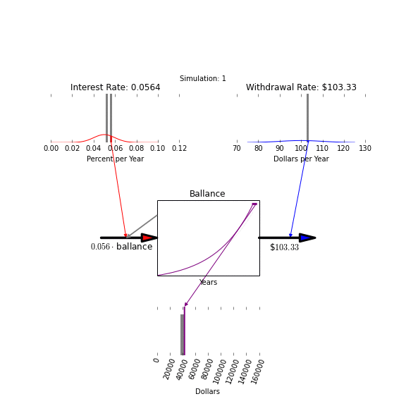
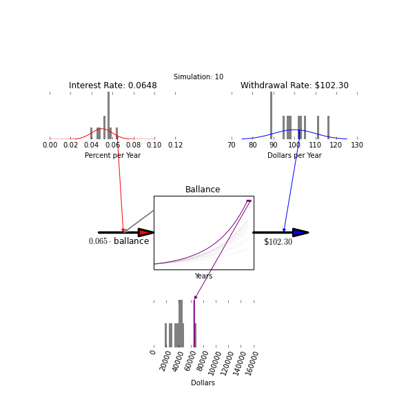
We'll start by specifying probability distributions for these two variables. We'll choose to represent our interest rate as a normal distribution with mean 0.05 and standard deviation 0.01, and our withdrawal rate as a normal distribution with mean 100 and standard deviation 10.

In the animation that follows, we build up histograms for the input and output parameters by grouping both input parameters and outputs into bins. We can compare the input distribution with its histogram to get a sense for how well our calculation has recreated that distribution by taking samples from it.

For the output distribution, we only have a set of points - samples from an underlying, true distribution that would emerge if we took an infinite number of runs in our Monte Carlo. In the next two animations, we see how these distributions build up as we run more simulations.
As the number of simulations becomes large (into the thousands) we start to see good convergence between the ideal input distributions and the distributions represented by our samples. This gives us confidence that the output samples are likewise converging on the hidden true value of the expected output distribution.
Here's a link to the ipython notebook for generating these plots.